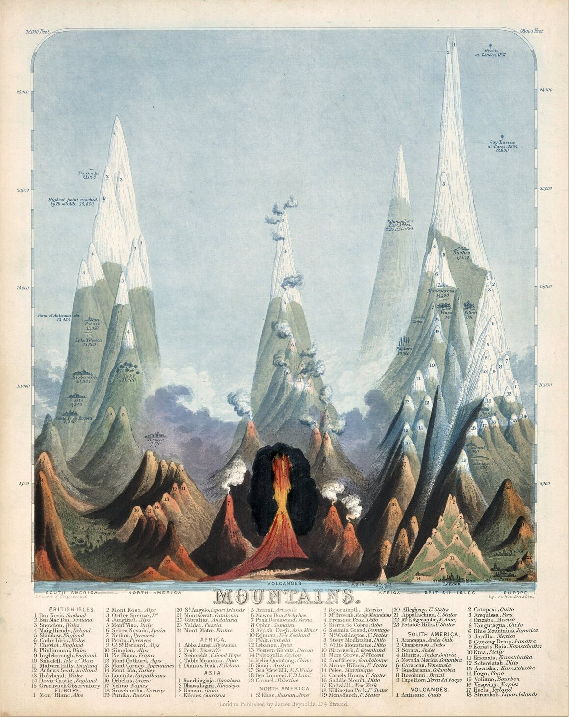
Have you ever wondered what the tallest active volcano is? Or wanted to compare the height of mountain peaks and the lengths of rivers around the world? So did John Emslie and James Reynolds.
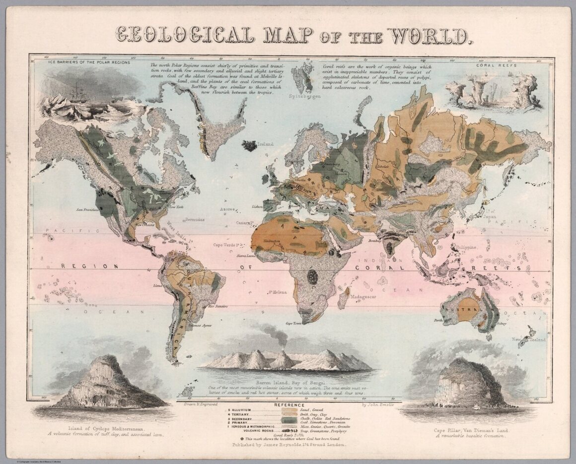
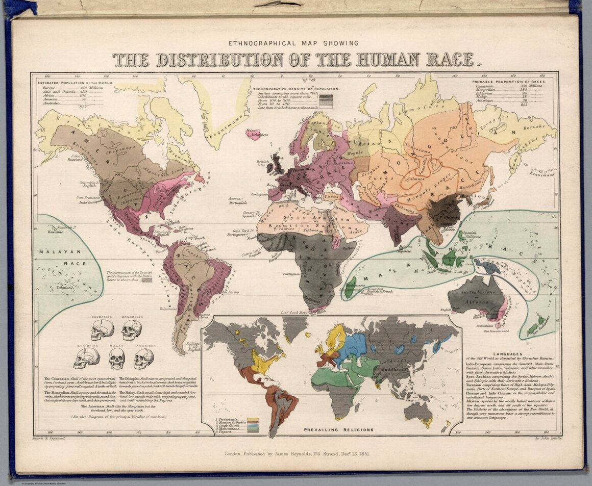
Between 1849 and 1851, topographical illustrator and engraver Emslie and publisher Reynolds devised scientifically based diagrams that measured out these geologic landforms and features in the 12-plate book Geological Diagrams. During the era, chartmakers helped increase accessibility and visibility of the latest scientific research by creating maps, illustrations, and figures depicting natural and man-made wonders around the world.

Emslie and Reynolds “take numbers, acute scientific details, and measurements, weaving them into something that’s beautiful to look at and easier to understand,” wrote Sara Barnes in My Modern Met. Part art and part informational chart, these pieces are early scientific infographics that serve as the foundations of the educational diagrams we see today.

The 1800s were marked by significant scientific discoveries, from the first observation of Neptune to theories of evolution. As early as the beginning of the 19th century when Alexander von Humboldt created what are considered the first infographics, publishers and cartographers designed a wide array of vivid displays to explain these new and complex ideas to the public. Reynolds' publishing business in London printed an enormous output over his approximately 30-year career, responding to the popular demand for information on science and engineering developments. Reynolds worked with several cartographers and engravers, but one of his main collaborators was Emslie.
Together, they produced numerous infographics and maps, and were both elected to England’s Royal Geographical Society—a professional organization dedicated to providing accurate cartographic and geographic information. The appeal and charm of their work comes from a combination of formal cartographic techniques, scientific knowledge, and artistic flair.

Colored by hand and highly detailed, Emslie and Reynolds’ 1851 Geological Diagrams is one of their many artistic portfolios. Maps show the distribution of plants, air currents, and religion, while charts ingeniously splay out major rivers, mountains, waterfalls, and even famous historic buildings.

For example, the panoramic map of principal rivers and lakes line up a selection of the world’s major rivers, visually comparing the lengths of the Colorado, Rhine, Nile, and Amazon rivers. Each are dotted by the major cities that they run through. Above the row of rivers, different lakes including the Dead Sea, the Caspian Sea, Lake Geneva, and Lake Erie are compared. You can see just how expansive the Caspian Sea in Russia and the Black Sea in Turkey are from this view.

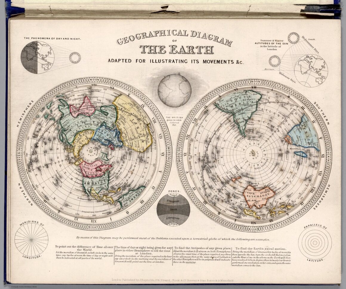
In addition to the 12 engraved plates in Geological Diagrams, Emslie and Reynolds also worked together on other volumes and single issues of optical charts, school atlases, and astronomical diagrams. Emslie shows the differences between astronomical and geographical clocks, the earth’s revolution around the sun, and the topographical surface of the moon. Some of the astronomical maps were made transparent, allowing viewers to amplify and highlight celestial bodies and constellations by shining a light through the back.

Currently, a selection of Reynolds and Emslie’s astronomical diagrams from the 1850s can be viewed in person at the David Rumsey Map Center at Stanford University’s Green Library. Explore more of these early scientific infographics below.


Map Monday highlights interesting and unusual cartographic pursuits from around the world and through time. Read more Map Monday posts.