In order to preserve their value to the historic record, FBI files on prominent individuals and groups are routinely handed over to the National Archives for safekeeping. It’s a nice idea. It would be even nicer if anybody could remember what exactly they handed over and where they put it.
Earlier this year, we ran a crowdsourced campaign to request FBI files on famous women. One of the first names on that list was Lucy Parsons, the labor organizer and activist whose name has become synonymous with people doing the kind of work that should be done.
We filed the request, and a month later, the FBI wrote back, saying that Parsons had, unsurprisingly, made the cut, and records had already been sent to NARA.
They did, however, provide the specific reference numbers for the Parsons files, which should make tracking them down in Archives a cinch.
“Should” being the operative word here.
We refiled the request with Archives and provided said reference numbers. About a week later, we heard back - those numbers weren’t for Lucy Parsons, but 30 years of investigatory files on the Communist Party of the United States, consisting of “approximately 178,000 pages in 71 boxes.”
With no ability to narrow the search any further, and Parsons at best a definite maybe in any of the files, the request was closed as overly burdensome, and we were directed back to the FBI to begin the whole process all over again.
Sadly, this is far from an isolated incident - just a few months earlier, a request for the FBI files on Dorothy Parker was similarly rerouted to NARA. In that case, the numbers provided by the FBI referred to a file where she was only mentioned in passing, and another file regarding a completely different woman who happened to share Dorothy’s maiden name.
Considering the FBI’s less than stellar track record with record keeping, we applaud their efforts to ensure the long-term preservation of these valuable, first-hand accounts of the people and events that shaped history.
But if nobody can find the damn thing, it kinda defeats the point.
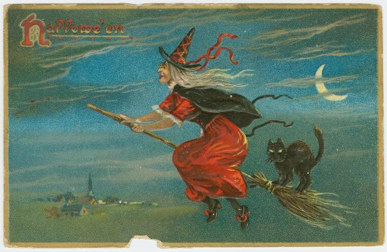
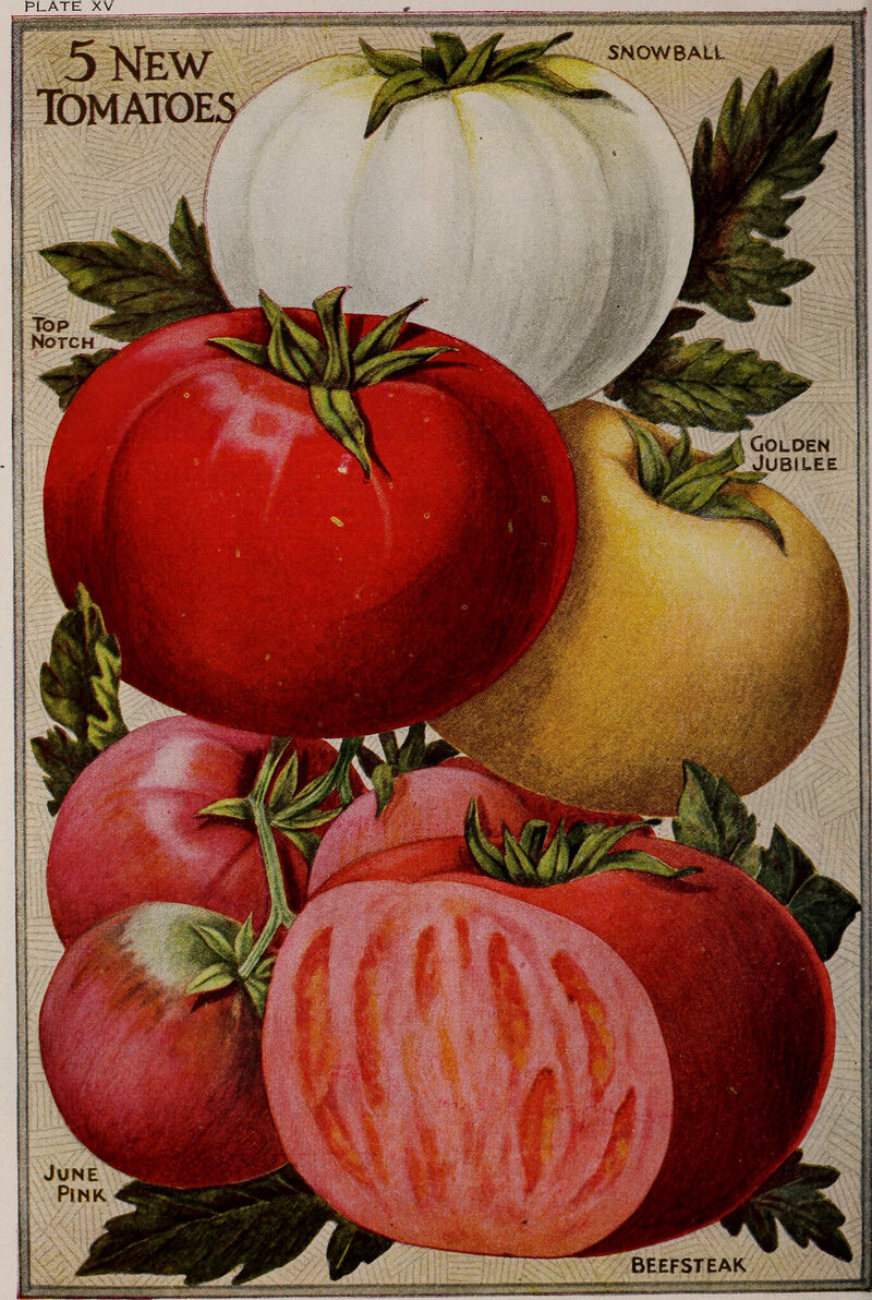
No other vegetable has been as maligned as the tomato (and it is a vegetable, by order of the United States Supreme Court). We call tomatoes killers. We call them rotten. We call them ugly. We call themsad. To find the reason why, you have to go back to the 1500s, when the humble fruit first reached European shores (and it is a fruit, by scientific consensus). Through no fault of its own, the tomato stepped into the middle of a continent-wide witchcraft panic, and a scientific community in tumult.
Between 1300 and 1650, thousands of Europeans (mostly women) were executed for practicing witchcraft, in a church-and-government-sanctioned mass hysteria academics call the "witch craze." Women were burned, drowned, hanged, and crushed after trials in both secular and religious courts; and lynched by vigilante mobs. By the most conservative estimate, Dr. Ronald Hutton's count of execution records, between 35,184 and 63,850 witches were killed through official channels—at least 17,000 in Germany alone. Sociologist Nachman Ben-Yehuda estimates the combined death toll could have been as high as 500,000. It was a massive, concerted, prolonged crusade.
At the time of the tomato's importation around 1540, diligent witch hunters were particularly interested in discerning the makeup of flying ointment—the goo witches smeared on their broomsticks (or on themselves, pre-broomstick). This potent magical gunk did more than enable airborne meetings with the devil; it could also transform the witch—or her unwilling dupe—into a werewolf, as described in case studies by prolific witch-hunter Henry Boguet, who noted that witches particularly enjoyed becoming werewolves in order to attack the left sides of small children, and to stalk through cursed and withering cropland.
The key ingredients, recorded by the pope's physician Andres Laguna in 1545, were agreed by consensus to be hemlock, nightshade, henbane, and mandrake—the final three of which are the tomato's close botanical relatives. Why any woman would keep this ointment around in such a dangerous climate, we can only speculate; the best guesses are drug addition, atropine-based painkiller, and they didn't. In contrast, tomatoes' similarity to deadly nightshade is plain to the untrained eye: the plants are practically identical. And although tomatoes were clearly edible—the Aztecs ate them, after all— it's hard to tell the difference between yellow cherry tomatoes and hallucinogenic mandrake fruit.
Then as now, the overlap between people suspicious of new foods and people suspicious that an adventurous neighbor might be a servant of the devil was pretty high. Try a tomato and risk turning into a werewolf, or being branded a witch? No thank you. Tomato eating was best left to places like Spain, where the Spanish Inquisition had at least temporarily declared belief in witchcraft (and therefore accusations of witchcraft) heretical.
But even men of science—men who would never believe in something absurd like magic—found the tomato exasperating. Until the Enlightenment took hold, botanists relied on a thousand-year-old categorical framework established by Galen, a physician who lived in Ancient Rome. When new and unfamiliar American plants arrived—corn, blueberries, chocolate—naturalists didn't know what to do. They scrambled to figure out ways the new imports were actually old plants that could slot into the existing system. The alternative was terrifying: accepting that the great Galen had never heard of these plants would imply, as David Gentilcore describes in Pomodoro, that the ancients hadn't known everything; that perhaps the world was in some sense unknowable; that the Garden of Eden hadn't existed.
Given the tomato's similarity to an existing plant—nightshade—it could have escaped the controversy. However, bits of Galen's writings referred to plants or animals whose identities had never been nailed down, and American arrivals seemed like candidates to fill the gaps. One such mystery plant was the λυκοπέρσιον, which translates to wolf-something—maybe "wolf banisher." It transliterates to "lycopersion," but during the Age of Exploration was mis-transcribed as "lycopersicon": wolf peach.
Galen describes it as a poisonous Egyptian plant with strong-smelling yellow juice and a ribbed celery-like stalk. At least as early as 1561, Italian and Spanish botanists, no doubt aware of witchfinders' werewolf suspicions, were kicking around the idea that the wolf peach and the tomato could be one and the same.
This classification was controversial. Not only was the tomato far from poisonous, but as naturalist Costanzo Felici observed in 1569, it couldn't have come from ancient Egypt and Peru. As seed traders waited for the vernacular to establish itself, their manifests might list tomatoes as golden apples, Peruvian apples, love apples, wolf peaches, and more.
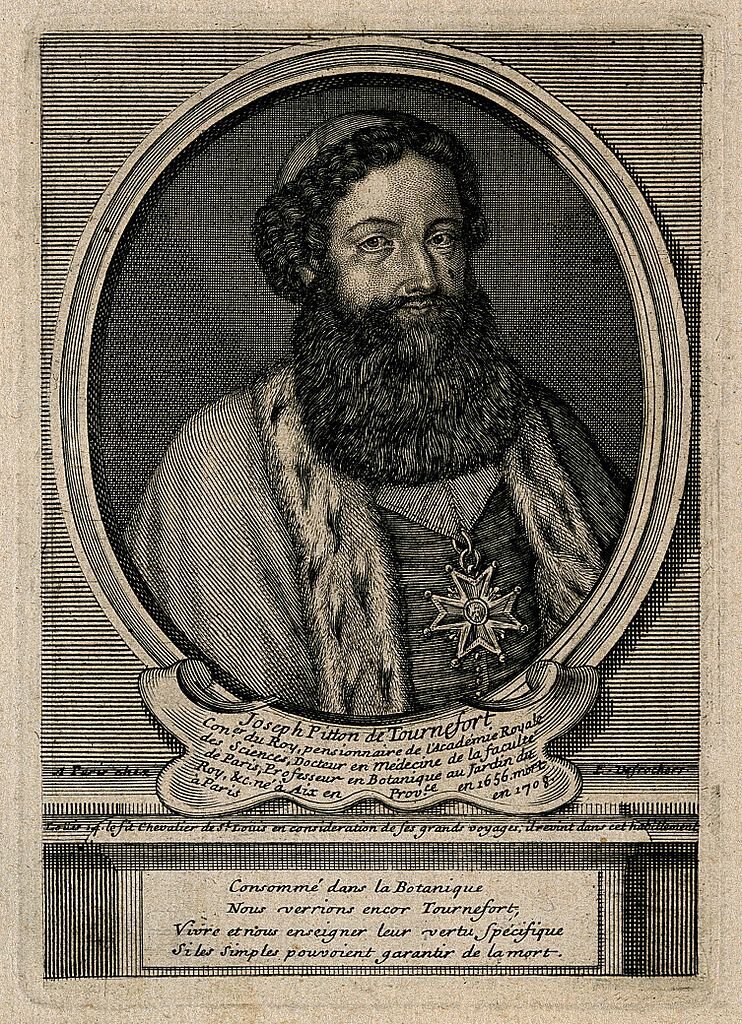
The debate was eventually settled by Joseph Pitton de Tournefort, Louis XIV's botanist, who accepted the tomato's werewolfish "lycopersicum" name in his hugely influential three-volume 1694 Elemens de Botanique. (Surely you've noticed that "lycopene" sounds an awful lot like "lycanthropy.") He went so far as to call the tomato the "Lycopersicum rubro non striato"—the red wolf's peach without ribs.
The name stuck, Tournefort's treatise was definitive, and his definition dovetailed with existing beliefs, especially in England, where physicians had dismissed the tomato as unworkable. According to James I's apothecary John Parkinson, though tomatoes could "coole and quench the heate and thirst of the hot stomaches" in places like Spain, Italy, and the Caribbean, England was already clammy enough. Eat tomatoes in a cool, rainy climate, and you'd find yourself on the wrong side of the medieval equivalent of "feed a fever; starve a cold."
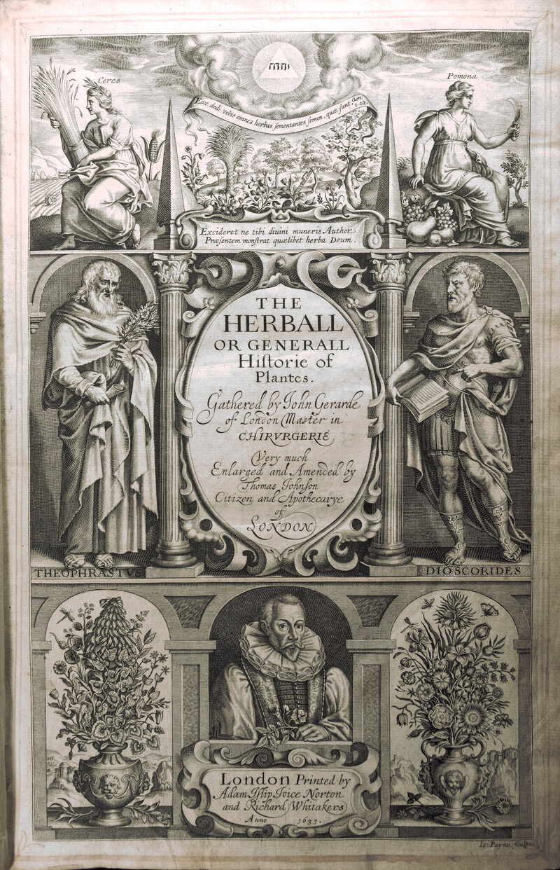
English barber/surgeon John Gerard had gone so far as to say tomatoes were "corrupt" in his 1597 Generall Historie of Plantes. "Rank and stinking," he clarified, in case a reader was tempted by the Spanish and Italian recipes he included (fried with salt and pepper, or eaten raw with vinegar).
Much of the English population agreed, as did their descendants in what would become New England. Tomatoes were pretty, but gross and just maybe satanic even according to scientists. Adventurous eaters like Thomas Jefferson were welcome to partake, but the rest of us were better off not risking our stomachs. A contingent of English emigrants in America rejected tomatoes all the way up to 1860, when the U.S. Civil War finally mainstreamed tomato-eating—an aversion that gave rise to the medical shorthand "the tomato effect," a description of effective therapies avoided for cultural reasons.
That's not quite the same as a culture-wide belief that tomatoes were poisonous, which probably never occurred. Andrew Smith, author of The Tomato in America, could only locate three references to tomato deadliness in his survey of pre-1860 American literature—and in all of them, the authors insisted they themselves weren't afraid. The most prolific American anti-tomato lecturer was a Harvard-trained doctor named Dio Lewis, who spent the 1850s blaming tomatoes for everything from bleeding gums to hemorrhoids—because, he argued, tomatoes' medicinal powers were so strong it was easy to overdose. For the most part, the people who didn't eat tomatoes just didn't like them, in the same way most of us don't make dandelions and ants a staple of our diets.
But it's hard for facts to get in the way of a well-established superstition. One contemporary urban legend ties the tomato to a rash of lead poisoning—acidic tomatoes leeching the lead out of pewter dinnerware to drive 16th-century aristocrats mad—but tomatoes aren't acid enough, pewter dishes were never common enough, and lead poisoning accumulates too slowly to be linked to a specific meal. In another frequently-repeated tale, debunked by Joan R. Calahan in 50 Health Scares That Fizzled, Colonel Robert Gibbon Johnson astonished a crowd in Salem, New Jersey with his brave ability to eat a basket of tomatoes and live. There's even a fabricated story that George Washington's chef tried to poison him with tomatoes.
More recently, when NASA distributed tomato seeds that had been to orbit, the L.A. Times freaked out about the imagined potential for poisonous mutations, and the panic went international. When NASA did the same with basil, nobody cared.
A lawyer from my hometown of Winchester, Massachusetts told me a few years ago that there was a law on the books banning tomato gardens—an artifact of early 20th century anti-Italian racism, meant to keep the neighborhood cleanly Anglo-Saxon. A search through the town clerk's annual reports from the town's founding to the present makes it clear no such bylaw ever existed. But my lawyer believed it did, just as many law blogs happily (and inaccurately) report that the General Laws of Massachusettsforbid putting tomatoes in chowder.
My lawyer didn't realize she was repeating a werewolf myth, done up in sheep's clothing. It slotted Massachusetts zoning codes into an older story of Puritan sumptuary legislation which regulated minute personal behaviors and set the stage for the Salem Witch Trials, and it replaced werewolves with southern Italian immigrants—who were, according to bigots in the early 1900s, dangerously swarthy, overly sexual, unpredictably violent, and presumably slavering.
The thing that didn't change was tomatoes. With tomatoes, we made up our minds a long time ago.
In its backward glance at the 1870s, Edith Wharton’s The Age of Innocence (1920) treats readers to a peculiar spectacle on the occasion of an engagement. As the young bride-to-be, May Welland, presents her left hand—recently sapphire ring-bejeweled by her fiancé, Newland Archer—to her socialite grandmother, the grandmother seems more interested in her appendages than the jewels.
“But it’s the hand that sets off the ring, isn’t it, my dear Mr. Archer?” she says. “Mine was modeled in Rome by the great Ferrigiani. You should have May’s done, my child. Her hand is large—it’s these modern sports that spread the joints—but the skin is white. And when’s the wedding to be?” she broke off, fixing her eyes on the soon-to-be groom's face.
The vignette’s curiosity reveals much about the Victorians’ conviction that hands contain meaning. They represent idealizations and expectations of gender, worthy of immortalization in sculpture; they serve as an index of social anxieties, synecdocichally drawing attention to unruly bodies and desires; they emblematize socioeconomic status, showcasing the trappings of wealth and the hardship of poverty. In fact, the fashion of the age —both popular and “scientific”—contended that cheirosophy or chiromancy—practices we now playfully, even derisively, call “palm reading”—could reveal an individual’s character and life trajectory.
Popular magazines at the time, The Strand included, also tried their hand at arguing for the appendage’s intrinsic significance with a two-part exposé by Beckles Willson that argues, “The hand, like the face, is indicative or representative of character.” The author follows up his self-assured assertion with what amounts, delightfully, to pin-up shots of famous hands accompanied by the author’s frequently laudatory evaluations of their respective merits. Willson’s enthusiasm uncovers a cultural predilection for objectifying hands that had enjoyed popularity for several decades by the time his article appeared; and while it remains fashionable even today to suggest otherwise, it proves quite difficult to deny that the Victorians were, in fact, not at all averse to getting handsy.
The Victorians’ flamboyantly flaunted their finger fetish in the glassware mass-produced for their newly fashioned and notoriously extravagant dining habits; human hands—in myriad forms—became motifs that could teach, terrify, and/or titillate. In the case of the “Tree of Life” pattern created by the Hobbs Brockunier Glass Co. of Wheeling, West Virginia, anyone seeking cream and sugar for hot beverages faced being forced into fondling miniature hands, sparking frisson as users contemplated a socially sanctioned, though somehow still oddly illicit (and vaguely creepy) frottage culminating with a splash of cream.
Other pieces, like the matching spooner, don disembodied digits holding vessels aloft, whose pattern name and symbolic elements conjure origin myths and invite the contemplation of procreation.
Additional “handy” examples from the pattern include compotes, cake stands, and an epergne, that invited diners to admire, though not necessarily touch, disembodied hands balancing pronouncedly phallic shapes.
Other tableware from the period, including James Hadley’s iconic sculpture-turned-spill vase “Mrs. Hadley’s Hand,”(circa 1864) produced by Royal Worcester in Worcester, England, and redecorated by other artists like Eduard Bejot, invited gazers to engage with the grasping—even gripping—potential of the female hand. While Bejot’s tarted-up version screams privilege with all its paste jewels, Hadley’s original evinces turquoise-braceleted middle-class style.
This lust for the clutching female hand expanded considerably from Hadley’s form to include flowers, cornucopias, torches, seashells, even corn on the cob. Each form sports jewelry—rings and bracelets—and manages to look altogether more alluring than Thing ever could hope to.
Whereas the fine porcelain of Royal Worcester proved prohibitively expensive to the average consumer, chalkware and pressed glass examples were inexpensive—but eye-catchingly expressive—alternatives to objectify the female form.
As the 19th century progressed, these tantalizing hands re-formed as they endeavored to evoke moralistic messages by reminding butter-seekers, for example, of time-worn adages, whose symbolism may have harbored a caveat about entertaining notions and seeking out other lither, more comely hands.
Not all disembodied hands objectified the feminine to titillate diners; others conveyed messages about social justice and the obligations of privilege, though with no less of a tactile treat, perhaps, for those receptive to the charms of the male hand. One example, Vallerysthal’s “Beggar’s Hand” toothpick holder, stylishly nudges dinner guests to consider the less fortunate as they clear the debris of overindulgence from their teeth.
Dinner guests encountered a similarly charged message when their hosts served up sugar in O’Hara Glass Co.’s “Pennsylvania Hand,” that features a fist clenching a scroll or bar.
Because most glass manufacturers of the period failed to maintain detailed records, it proves exceptionally difficult at this remove to establish the intended meaning of this particular motif absolutely. However, the clenched fist – whether it sports a bar or a scroll – has been a recurring anti-slavery, pro-freedom, even pro-black, motif. It may also have a connection to President Abraham Lincoln, whose modeled hands enjoyed a certain brand of fame in the mid-19th century. While it is possible, of course, that none of these possibilities capture the designer’s meaning, these masculine hands clearly convey strength all while objectifying them for dinner guests to caress.
In other cases, and perhaps more delightfully because of their absurd appearance on a single piece in an entire line, men’s hands make an appearance to thrust forth a creamer’s handle, affording yet another hand-holding opportunity at the dinner table.
Ever more suggestive, perhaps, were those hands inviting users to put them to whatever use they might conceive—nefarious or otherwise—as they stretched out to be filled.
While it might seem a bit sophomoric to suggest these housewares figured in erotic play or some other tomfoolery, the Victorians’ impishness (especially considering their fondness for furtling) suggests that these trays invited more than utilitarian use, pregnant with possibility and meaning. The most famous example, produced by various companies in the U.S. and Europe, erroneously titled “Queen Victoria’s Hands,” were not, in fact, modeled on the imposing monarch’s hands – though she too obsessed over disembodiedappendages and continues to be surrounded by free-roaming hands even today.
The tray itself doubtlessly found endless uses, including safekeeping calling cards, jewelry, and other trinkets like buttons, even those featuring bodiless hands of their own.
Regardless of what they stored—or their received meaning—it does not require a palm reader to pronounce that the expressive and tactile potential of myriad unattached mitts held them in sensual thrall. They also illustrate beautifully, if eerily, that the Victorians were indeed a handful—in the best ways possible.
You can also read more about many of these extraordinary places in our new book. And if you know of an incredible place that we missed, you can add it to the Atlas here! We can’t wait to see what the next 10,000 will bring.
One evening last month, I was standing with my family on a landing looking out over Cayuga Lake, in Ithaca, New York, when we heard a loud thud. Just a few feet from where we standing, some animal, still living, had fallen on the hard concrete surface.
It looked like a bat—at least, we could see a pair of bat wings. But, whatever it was, it looked grosser and much creepier than just a bat. As we approached, with caution, we could see two small, furry bodies...but no heads.
One of the bodies was pulsating and twitching. We couldn't tell what was happening, but it looked like one of them might be eating the other.
Here's a video of part of what we saw:
As you can hear in the video, we were a little freaked out — the weirdest thing was that we couldn't figure out where either of the animals' heads were. Had a rabid bat attacked another? Had another unfortunate creature (a frog? a tiny weasel?) tried to eat the bat, only to be flown to this distant dock? Could the bat have gotten itself into this situation, to its immediate regret?
When I asked bat experts to look at this video, though, a consensus emerged.
These were two bats, having sex.
What we had encountered were two Eastern red bats in mating season. The male, the redder bat, is on his back — that's his tail curled up over the female, who is grayer. According to the bat experts I consulted, bats can be so focused on mating that they fall out of the sky. The male can also grab onto his partner so fiercely that he will leave bald patches on her neck.
The lesson of this story? If anything, it's that sex can look pretty creepy—especially if it's not your species.
Picture this: You’re out on the woods on a fair autumn afternoon when you’re stopped in your tracks by the horrific sight of the devil’s fingers emerging from the earth. Your mind flashes back to that day in third grade when you stole Jimmy Patterson’s lunch and blamed Amy Johnson for it. The devil has finally come to take you back with him.
As the fingers come out of the earth, they seem as if they’re looking for you. They get closer and closer until they, suddenly and with seeming pain, deflate, leaving behind the putrid smell of rotting flesh. You’ve been saved from damnation—or you’ve simply encountered one of the world’s most visually horrifying fungi.
This time-lapse video, shot by Belgian photographer Kris Van de Sande, captures this exact scenario by following the hatching and maturity processes of the devil’s fingers (Clathrus archeri). Also known as octopus stinkhorn, this fungus is unique in its shape. It hatches from an egg-like stage and develops four to eight arms which move freely. Its reddish inner skin is dotted with black spores and exudes a horrid smell that’ll make you feel as if you’re in a horror movie.
In real time, the devil's fingers life cycle takes place over several hours. But with this time-lapse version available, why prolong the horror?
Every day we track down a Video Wonder: an audiovisual offering that delights, inspires, and entertains. Have you encountered a video we should feature? Email ella@atlasobscura.com.
Walking through the Catacombs of San Gaudioso is a study in intergenerational cooperation. As you enter, you're greeted by a fifth century fresco of the Apostle Peter, his hands clearly beckoning you in, his entire head effaced by time. Minutes later, you're face-to-face with the skull of an 18th century nobleman, stuck in the wall over a portrait of its previous owner.
Above you, through the stone ceilings, cars rumble through the streets of modern-day Rione Sanità, a neighborhood smack in the middle of Naples that is caught in the claws of a global recession. And in front of you, explaining all of this, is an enthusiastic Neapolitan teen—the only reason you get to go down here in the first place.
These teen tour guides are members of La Paranza Cooperative—a group of young locals united by their desire to help their city and their love of the catacombs, which they reopened to the public. "The silence, the smell, and the history, it gives you this feeling," says Vincenzo Porzio, the organization's communications operator. "It's like traveling back in time."
Porzio and four of his friends started La Paranza Cooperative ten years ago, for two reasons. First, their community was hurting. The recession hit southern Italy hard: about a fifth of citizens are unemployed, and for young people, the statistic rises to 75 percent. Without employment prospects, many of Porzio's peers have trouble envisioning a future for themselves. Some flee to Berlin and London. Others end up joining the mafia, which has used this disillusionment to swell its ranks.
Thanks to centuries of biased urban planning, Rione Sanità is even worse off than your average district. Back in the 17th century, Porzio explains, Neapolitan nobles would travel down into the Rione Sanità valley on their way from the center of Naples to the Royal Palace in Capodimonte, on the city's northern edge.
This route was popular, but indirect, and the diplomats eventually funded a bridge that linked the center and the palace directly. This cut down on travel time for the royal family, but completely isolated Rione Sanità. At that point, the district "started to become like a ghetto," and never stopped, says Porzio.
This gave Porzio and his friends another impetus: "We needed to see our cultural heritage valorized," he says. Rione Sanità is literally full of history, as the city sits on top of nine different catacombs and ossuaries, carved into the earth over centuries. The ancient Romans webbed the sides of the valley with tunnels, which they used to store water. In 452 AD, when the bishop St. Gaudiosus died in Naples, he was buried in the tunnels. Fifth-century tourists flocked to his gravesite, and the ancient infrastructure became an underground cemetery—the Catacombs of San Gaudioso.
The entrance to the catacombs lies under the altar of the Basilica of Santa Maria della Sanita, itself a marvel of baroque architecture, full of sun-drenched marble and topped with a green and yellow ceramic dome. Here was a portal to another time, sitting unused inside the city's most beautiful building. If people had been literally driving over Rione Sanità, maybe this could make them slow down.
After what another founding member called "some pretty serious negotiations" with the Vatican, which is in charge of Catholic relics, the five teenagers linked up with a local priest, raised seed money from local donors, and began leading tours of the catacombs. "We didn't wait for the public administration," says Porzio. "We worked by ourselves."
Fast forward ten years, and La Paranza Cooperative is a thriving, economically sustainable business. The five volunteers are now 20 paid employees, and they lead 70,000 visitors on catacomb tours every year—visitors who then patronize other local hotels, shops, and restaurants.
"We have met really nice people," says Porzio. Some of these people turned out to be local archeologists, who are helping them open more and more catacombs, and keep the art and bones inside safe for future generations. Others were electricians and engineers—the tunnels are now lit with LEDs, and several of them are handicapped-accessible. "Between frescos, mosaics, and places you can walk in now, we have restored 10,522 square meters of cultural heritage," says Porzio.
La Paranza does a lot of work aboveground too. They have part ownership in two bed and breakfasts—one a transformed convent, the other a rehabilitated monastery, naturally. They spurred the creation of a youth orchestra, a theater company, and two "homework houses." On weekends, they lead longer tours through the whole city, dipping in and out of historic churches, down into the catacombs, and then back up into the streets where all of their work got started. It's a lot of logistics for a Sunday, but Porzio doesn't mind. "It's a job which we don't actually call a job," says Porzio. "We're working for the image of our city."
Since the very first star charts carved into mammoth tusks 32,500 years ago and the first recorded constellations in 17,300-year-old French caves, humans have come up with a variety of interpretations of the night sky. In the 17th century, star cartographer got a step closer when he produced the first star atlas that mapped the entire observable night sky.
In 1603 Johann Bayer, a German lawyer and celestial cartographer, and artist Alexander Mair published the first edition of Uranometria—an atlas comprised of 51 copperplates engraved with celestial constellations. Uranometria, the full title translating to “Uranometria, containing charts of all the constellations, drawn by a new method, engraved on copperplates,” was applauded both for its accuracy and beauty.
Mair’s intricate constellation engravings challenged the aesthetics of astronomical charts, while Bayer’s cataloging and classifications were widely accepted by the scientific community. The atlas is said to be the first to capture the entire celestial sphere, adding 12 new constellations and filling in the missing southern celestial pole which had only been previously documented in a few expensive globes.
Before Uranometria, star catalogues used verbal descriptions to describe the locations of stars within famous Greek astronomer and writer Claudius Ptolemy’s 48 classical constellations. However, this system led to constant errors and misinterpretations of celestial body positions.
Bayer’s depiction of the sky included more stars than previous charts. He used a foundation of 1,005 stars observed by Danish astronomer Tycho Brahe, who was commended for his accurate and comprehensive astronomical documentations, and added an additional 1,000 stars he had charted on his own. His classification system, known as the Bayer designation, categorized each star by its brightness—alpha being the brightest star in a constellation, beta being the second, and so forth.
Each of 48 Greek constellations are shown on separate plates, or star maps. They are carefully engraved on a grid with margins calibrated for each degree, allowing star positions to be read a fraction of a degree from the margins using a straight edge, writes Nick Kansas in Star Maps: History, Artistry, and Cartography.
The 12 new constellations in the south celestial polar cap are illustrated together on a single planispheric map, Chart 49 (seen above). The constellations were first observed and recorded by Dutch navigator Peter Dirkszoon Keyser, and were depicted on globes. However, since globes were expensive, Bayer’s Chart 49 was more easily accessible to the wider public. Among the 140 stars plotted in this chart, the new constellations show a wide variety of creatures, including the Phoenix, Hydra, and the strange-looking Chamaeleon.
Bayer also records rough fractions of the Milky Way, shown as a speckled wavy column—a unique characteristic of an early star atlas. Scholars so far have found 31 plates that show parts of the Milky Way, and continue to study Bayer’s work to understand where he obtained this data.
While the atlas is centuries old, entities within the carvings remain relevant today. Art critics and historians have deemed the book a splendor;Philip Hofer, author of Baroque Book Illustration, called it an “example of fine astronomical illustration.” Bayer’s star classification system is still practiced,and Uranometria’s depiction of the twinkling celestial bodies the first to be considered scientifically useable.
View more wondrous constellation engravings in the 1655 edition of Uranometria below.
Map Monday highlights interesting and unusual cartographic pursuits from around the world and through time. Read more Map Monday posts.
There are a lot of amazing things about the African Pouched Rat. For one thing, they're enormous—more cat-sized than rat sized, they're about three feet long from tail to nose. For another, those noses are pretty wonderful. African Pouched Rats can't see or hear very well, but they make up for it with a sense of smell at least as good as a dog's.
They're such good sniffers, in fact, that they're now government contractors. The US Fish and Wildlife Service announced Friday that they've hired a group of the rats to fight wildlife trafficking, to the tune of $100,000.*
A pilot project in Tanzania, partially funded by the USFWS, aims to test whether the rats can identify shipments of illegal biological products by their smell. Wildlife products like pangolin skins and certain hardwoods are constantly crossing borders, often well-disguised. It is hoped that the rats will be able to cut through the olfactory noise and pinpoint which shipments aren't supposed to go through.
These won't be the first pouched rats to use their schnozzes for science. Earlier this year, NPR profiled a rat named Chewa, one of a whole Tanzanian rodent team that diagnoses tuberculosis by smelling sputum samples. They're cheaper and faster than traditional lab tests, and more fun, too—"they jump on our shoulders," one employee said. The same organization, called APOPO, also trains the rats to sniff out TNT, allowing them to scour former war zones for land mines.
If the trials go successfully, this will be "the first phase of a much larger project to mainstream rats as an innovative tool in combating illegal wildlife trade," the US Fish and Wildlife Department writes. If you're in the US and want to see an African Pouched Rat in action, you'll have to head to Florida—a wild, invasive population has wreaked havoc there since the late 1990s, when they themselves were illegally released by a breeder. Their high-achieving foreign relatives must be so ashamed.
*In case it is unclear, the rats won't be receiving this money—the project itself will. The rats are generally paid in room, board, and extra bananas.
Every day, we track down a fleeting wonder—something amazing that's only happening right now. Have a tip for us? Tell us about it! Send your temporary miracles to cara@atlasobscura.com.
Flying over Ireland is always a magical experience. But over the past few weeks, travelers speeding over County Donegal have been treated to a particularly mystical sight: a 300-foot-long Celtic cross, made of thousands of trees.
Passengers have been curious about the massive emblem, posting pictures and questions to social media. As UTV Northern Ireland revealed in a short video posted today, the man apparently responsible was Liam Emmery, a forester from the region. Emmery died in 2010, at age 51, after an accident left him unwell for two years. "Even his family knew little about his creation," which Emmery accomplished by planting different types of trees years ago, says UTV.
The effect has been visible for a few years now, but this year's dry autumn has made it particularly eye-catching, the yellow cross vivid against a background of spruce green. "We're going to be appreciating this for the next sixty or seventy years," horticulturist Gareth Austin told UTV. Not a bad way to go out.
It’s Halloween time again, and as it has been for the past 50 years, a Star Trek costume is a safe bet for anyone looking to dress up. But do you want to be a Starfleet captain in 2268? A ship's doctor in 2368? For the uninitiated, deciphering the language of colors and symbols that place you in the show's universe is a crapshoot.
Luckily, Atlas Obscura is here to help, with a bit of cosplay codebreaking.
This year marks the 50th anniversary of Star Trek, and from the first episode in 1966, the Starfleet uniforms worn by the crew of the U.S.S. Enterprise (and eventually elsewhere) have remained one of the most enduring and iconic aspects of the franchise. Aside from being deliberately utilitarian and futuristic, from the beginning, the uniforms have also been used to communicate a character’s rank and station, although depending on what period in the future you are trying to emulate, the language changes.
Gene Roddenberry imagined the space-faring fleet as something akin to the modern Navy, carrying over much of the same rank and job structure. Each ship has a captain, and subordinate ranks such as commander, lieutenant commander, and ensign. These ranks are spread out among various ship positions like command, security, engineering, science and medical. Within each series, and the movies, most of this can be gleaned just by looking at the character’s uniform.
In the original Star Trek series, which ran from 1966-1969 (or roughly from 2254 to 2269, in universe), there were three standard uniform colors among the Starfleet officers on the Enterprise: gold, blue, and red. During this time period you have gold uniforms being worn by people in command positions (Captain James T. Kirk, helmsman Lieutenant Sulu); blue uniforms were reserved for members of the science divisions, which included the medical staff (O.G. science officer, Lieutenant Commander Spock, and Doctor Leonard “Bones” McCoy). Then you have the hard-working folks in the red uniforms, who make up the operations divisions on the ship, including security and engineering (Chief Engineer Montgomery “Scotty” Scott, and countless, faceless extras that served as doomed security officers, also known as “redshirts”). Interestingly, as explained by a piece over on Mental Floss, the command gold was originally intended to be green, but came out yellowish-gold under the studio lights, and was simply embraced from then on.
Within the various career divisions on the ship, everyone held a different rank as well, which was denoted by a series of rings on the ends of their sleeves. The number of stripes denoting rank shifted a bit throughout the series, but for the most part, a safe reading of the uniforms is that two-three sleeve stripes indicated a captain, a single or double sleeve stripe indicated all other enlisted officers, and a braided stripe (or no stripe) indicated non-commissioned personnel.
This same system of tri-colored uniforms and ranked sleeve cuffs was also adopted in the more recent “Kelvin Universe” Star Trek films of the 2000s to current, with little variation to the meaning. What little difference does exist is in the ranked sleeves, which have been standardized to a trio of rings on a captain’s shirt; two bold rings for a commander; one thin ring, one bold ring for a lieutenant commander; one ring for a lieutenant; and no rings for an ensign.
Within these main Starfleet guidelines, there were variations in style (hello, v-necks and mini-skirts), and even color from time to time, be it for fashion or some mission-specific look, but if we’re looking at classic Trek, you can’t go wrong with those basics.
The Star Trek movies that followed the cancellation of the original series, threw most of the original coloring schemes out the window for a cleaner look, which is surprisingly harder to read. In 1979’s Star Trek: The Motion Picture (which takes place in the mid-2270s), the bright colors were done away with and replaced with white, grey, and beige uniforms.
Here, a person’s position could be determined by the color of the ring behind the Starfleet insignia on their breast. A white ring was used for command, orange and green were used for the science divisions, and red, gold, and grey were used for operations. Rank was now worn on either the sleeve and/or on a shoulder tab. Thankfully, these creamy jumpsuits didn’t last long.
By 1982’s Star Trek II: The Wrath of Khan, Starfleet (and the film’s production department) had adopted an even more standardized and militaristic look. Taking place around the late-2270s, the second film introduced a standard maroon color that was worn by all officers in jumpsuit and jacket styles. While some of the straps and collars were different colors, most of the rank and division information was denoted by complicated badges and insignias generally worn on the left cuff and on a strap on the right shoulder. Variations of these uniforms were worn by Starfleet officers throughout the rest of the original series films.
With the intricate mix of rank indicators and service badges, not to mention the constantly shifting positions of the crew throughout these films, reading the uniforms is a chore, even for die-hard Trek fans. In fact, this uniform style has come to be known as the “Monster Maroon” among fan costumers. Anyone looking for exact accuracy in a costume from this period should reference the always reliable, Memory Alpha wiki on the subject.
Fast forward to the 23rd century and the debut of Star Trek: The Next Generation in 1987, and once again we have a whole new language of uniform. This new series saw the return of the multi-colored officer uniforms, although they often meant different things from when Kirk first donned his velour captain’s shirt.
Now, the command crew of the Enterprise wore dark maroon (Captain Jean Luc Picard, Commander William T. Riker), and members of the operations staff wore gold-colored jumpsuits (Lieutenant Commander Data, Chief Engineer Geordi La Forge), reversing the scheme from the original series. The science and medical divisions stayed in the same wheelhouse though, and were denoted by uniforms in a range from blue to green (Chief Medical Officer Beverley Crusher, Ship’s Counselor Deanna Troi).
The rank designations also went back to a simpler system than that of the earlier movies. Beginning in The Next Generation, rank was now shown by a series of circular pips generally worn on the right side of the neckline. This pip system essentially broke down to the more pips someone has, the higher their rank. Captains wore four pips; commanders wore three; lieutenant commanders wore two full pips and one hollow one; lieutenants wore two pips; junior lieutenants wore one full pip, and one hollow pip; and lowly ensigns wore only a single pip.
Higher ranks such as admiral were often shown wearing variations of this system, such as four pips on a black field, or pips beneath a run of stars.
While the cut and style of standard Starfleet uniforms shifted and evolved as the years went on, this system of colors and pips holds true with little variation through the run of The Next Generation, its associated films, and subsequent series Deep Space Nine and Voyager. Commander (later Captain) Benjamin Sisko and Captain Kathryn Janeway sport a command maroon just like Picard did, and characters like Chief Engineer Miles O’Brien wore operations gold in both The Next Generation and Deep Space Nine. As far in the future as canon Star Trek looked (barring certain incidents of time travel), this was the visual language.
The most recent Star Trek television series, 2001’s Enterprise, was actually a prequel, taking place in the mid-2100s, and strangely, their uniforms take cues from every era of the Star Trek franchise. Taking place prior to the formation of the Federation Starfleet seen in later incarnations, the uniforms of the very first space-faring Enterprise, were once again standardized into a purple workman’s jumpsuit (echoing the red-washed uniforms of the later Original Series films). Position on the ship could be determined by the color of a seam that ran along the shoulder of the jumpsuit, with the colors corresponding to the original command gold, science blue-green, and operations red.
And then rank was indicated by the number of silver bars over the right breast, just like the pips used in The Next Generation. While not everyone’s favorite, this suit kind of had it all.
The beauty of Star Trek’s uniform standards is that they allow fans to dream up their own costumes and characters that could conceivably find a place on any Starfleet ship. If you don’t want to dress up like Captain Picard, you can just as easily envision a costume for Lt. Comm. Your-Name-Here. And with the limitless variation of designs within the ranking system, you can always tailor it to your personal style, so long as you are using the established fashion language.
Of course, there is a near unlimited amount of Trek novels, mirror universe tales, cartoons, video games, comic books and more where variations on this uniform symbology may differ. However, if you are looking to become a member of Starfleet this Halloween, you probably can’t go wrong sticking to the lessons seen on screen. Don’t get laughed out of another Star Trek convention.
Imagine the Manhattan Bridge twinkling from underneath with hundreds of small pods filled with decaying biomass – the final resting place of many former New Yorkers, shining like stars in an otherwise dark sky.
There, you might lay flowers near a pod containing the remains of a loved one, until decomposition finishes its course and all that remains is a container to keep as a remembrance.
This is the vision that is Constellation Park, a shiny new cemetery proposed by DeathLab, a trans-disciplinary research and design space at Columbia University. For the past five years, DeathLab has been focused—during an era of global warming, overcrowding and leave-no-trace environmentalism—on solving the problem of last rites in New York, where an average of 144 bodies stack up per day.
That, in turn, totals around half a million plots per decade, consuming nearly all of the ground left in the dozens of cemeteries and polluting the air with cremation smog in the New York metropolitan area.
It’s a lot of death, in other words, in a very small space, and how we’ll deal with it in the future is an open question (also explored by Hyperallergic in May). One thing’s for sure, though: it’s probably going to look a lot different than how we’ve dealt with it in the past.
Which is where DeathLab comes in.
“Remaining titled earthen burial plots are extremely limited and relatively expensive in New York City and in dense urban environments across the globe,” said Karla Rothstein, the director of DeathLab and an architecture professor at Columbia. “Engaging the corpse on its biological basis, DeathLab’s projects incorporate mortuary processes which are far less energy intensive, elegant, and scalable.”
In Bristol, England a similar project at the historic Victorian Arnos Vale cemetery won a prestigious design competition there earlier this year, allowing DeathLab researchers to work to build a design for a prototype. Here, the Manhattan Bridge project hasn’t even gotten that far along, but if stodgy old Britain can at least try, couldn’t New York?
For now, the answer is no, as the idea has yet to even come before the city council, while also facing fierce opposition from the funeral industry. But like a lot of things in New York it might, eventually, come down to a numbers game: if built, Constellation Park, could accommodate around 10 percent of deaths in the city each year—a number that seems small until you start to think about the alternatives, which can be environmentally disastrous.
Constellation Park isn’t the only alternative proposed, of course. Consider, also, promession, in which mortuary workers freeze dry a body in liquid nitrogen and then shatter it to dust with a slight vibration. Another is “alkaline hydrolysis, or “flameless cremation,” through which bodies are exposed to a lye solution and then broken down with the assistance of a low-energy pressurized chamber heated to 350 degrees. This process results in a “greenish-brown liquid containing amino acids, peptides, sugars, and salts.”
But, like Constellation Park, the latter ideas have been met with obstacles: No commercial prometorium, or freeze-dryer, has yet been built. And although seven U.S. states approve of flameless creation, religious institutions, including the Catholic Church, have declared the disposal of liquefied bodies “undignified,” contributing to the demise of a 2008 bill that would have legalized alkaline hydrolysis to New York.
Proponents of alternative means of dealing with corpses have said, however, that some religious institutions—and society itself—might have to rethink their burial dogma.
“The ways in which a cultural group has disposed of the deceased – since almost the beginning of human history – has often been a matter of environmental necessity,” said Christina Staudt, a DeathLab affiliate and the Chair of the Columbia Seminar on Death. “In the high altitudes of the Himalayas, where permafrost makes the ground impenetrable, earthen burial and burning of the body are not viable options, and a tradition of feeding the corpses to vultures developed.
“The values and practices of the current, mobile urban population,” Staudt adds, “where traditional groups rub against each other, share space and are forced to adapt and adjust to each other, have been described as fluid and kaleidoscopic.”
Which brings us back to Constellation Park, which would in part be made possible through the work of Rothstein’s colleague Kartik Chandran, who has been working on an anaerobic microbial digestion for corpses in which microorganisms consume bodies without the need for oxygen, reducing them to light.
Through that digestion, Constellation Park shines—and families wouldn’t have to, as Rothstein has put it, visit loved ones who lived in Queens for 85 years in New Jersey cemeteries 85 miles away.
It also means that the future of death in New York might be bright—at least for the living.
“Socio-cultural needs and desires are not static,” Rothstein said. “Honoring our dead is a basic human endeavor, and there are many valid practices, including new models, that can support this need.”
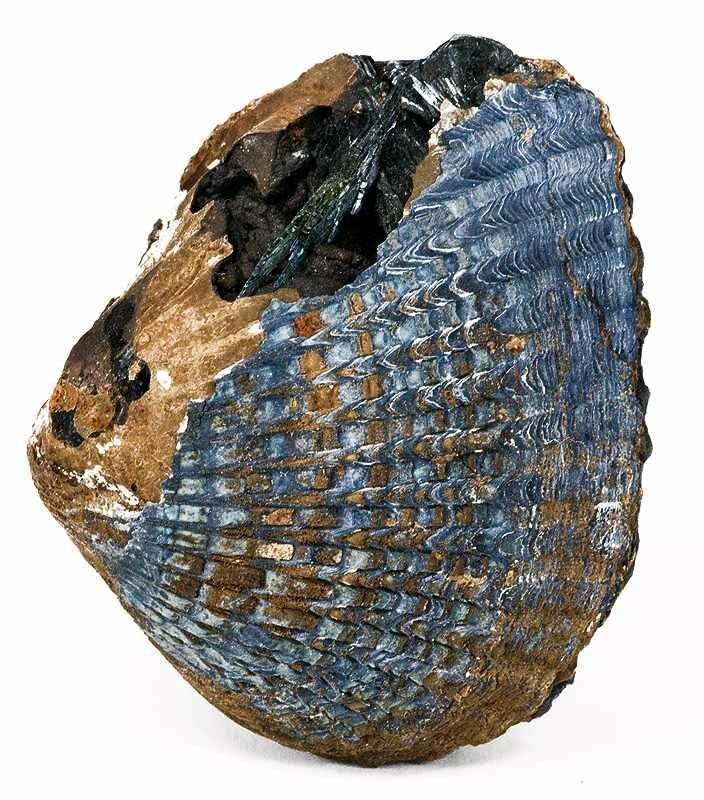
In 1861, a railway engineer by the name of John White passed away, was buried in a cast iron coffin, and began a slow transformation from White to blue.
The explanation for this spooky color change, which has occurred on numerous occasions all over the world, lies in the composition of the human body. Among the molecules contained within us is phosphate, a central phosphorus atom bound on four sides to atoms of oxygen. Phosphate is present in the hard bits of bones and teeth (as part of the mineral hydroxylapatite), helps hold together strands of DNA and RNA, and is used by cells to store and move energy around as well as to organize their many protein-driven activities.
If a dead person ends up buried somewhere waterlogged, lacking in oxygen, and loaded with iron, the phosphate leaking from their decaying remains can slowly combine with the iron and water to form a mineral called vivianite. It starts out clear and colorless, but will rapidly turn progressively darker shades of blue upon exposure to air as the iron within it reacts with oxygen. The formation of vivianite (also known as blue ironstone) is helped along by bacteria which act to dissolve iron out of soil and phosphate out of bodies while also directing the growth of the blue crystals.
In the case of Mr. White, in keeping with the styles of the time, his coffin had a glass window installed in the front so his face could be seen by mourners when the lid was shut. At some point after burial, the glass had broken, allowing groundwater to seep inside and react with the cast iron coffin and phosphate-rich body. The end result was a corpse surround by blue vivianite crystals, revealed when the coffin was exhumed as part of an archeological rescue excavation over a century after being buried.
Vivianite can form in, on, and around human remains. It appears as crusty patches on bones, needle-like crystals within the pulpy centers of teeth, and discolored blotches on skin. It’s also been found on adipocere, the waxy gunk occasionally produced as fat-filled flesh breaks down under cold and wet conditions.
Partially blue human remains have been recovered from graveyards, past warzones, and alpine lakes and glaciers. As iron is an essential ingredient in vivianite, it tends to show up in naturally iron-rich locales or in cases where a corpse ends up near a source of the metal: cannonballs strewn about a battlefield, the site of a plane crash, or iron coffins in an older cemetery. The skin of Ötzi the Iceman, a 5,000-year-old mummy discovered in the Ötztaler Alps between Austria and Italy after the glacier it was encased in partly melted away, is dotted with blue spots marking where it had been in close contact with iron-bearing rocks.
In addition to giving the dead a splash of color, the presence of vivianite can both help and hinder their investigation by archeologists and forensic researchers.
Firstly, vivianite can tell us about what happened to a person’s body after their death. In 1963, an American B-26B aircraft went down over a mountainous part of South Vietnam. Its crew was subsequently listed as missing in action. Decades after the war, their blue-tinged skeletal remains were identified and returned to the US. American investigators were initially confused by the blue material, suspecting it to be paint intentionally added by someone who handled the remains while they were in Vietnam. With further study the material was revealed to be vivianite, leading the investigators to speculate that the crew had been buried in waterlogged soil dosed with iron from their corroding aircraft—ideal conditions for the blue mineral to arise.
Vivianite can also disrupt efforts to study human remains. It’s a thorn in the side of archeologists who use DNA from well-decayed dead people to learn more about their ancestry and other gene-encoded characteristics.
After discovering a mass grave of soldiers who perished during a clash between the Austrian and Prussian armies in the spring of 1757 near what is now the city of Liberec in the Czech Republic (as part of the Seven Years' War), researchers had trouble analyzing DNA extracted from the skeletons. They traced the source of their problems to the blue crust coating the bones they were getting the DNA from.
Iron-containing minerals such as vivianite can mess with the molecular tool used to access small amounts of DNA present in biological remains. This tool, polymerase chain reaction (usually shortened to PCR), is essentially a DNA photocopier, making vivianite a paper jam of sorts. The inhibition of PCR by vivianite led the researchers to develop a new method for analyzing bones containing the disruptive mineral.
Finally, vivianite can protect human remains and provide information about burial sites. The North Brisbane Burial Grounds is a collection of cemeteries used until 1875 to bury deceased residents of Brisbane Town, now the capital of city of Queensland, Australia. A century later, it was partially excavated during a construction project, leading to the discovery of 25 graves containing vivianite. Researchers discovered the blue coating on the bones and teeth had helped to slow their decay, improving their archeological value. The presence of vivianite also served as evidence of occasional flooding of the burial grounds, confirming what had been reported in an early Brisbane newspaper.
Mr. White may have changed color thanks to vivianite, but a couple of other minerals can have a similar effect on the dead. Blue-green copper minerals are known to show up on human remains if there are objects such as bullet jackets, jewelry, or clothing buttons made of the metal nearby. No one said decomposition couldn’t be a little showy.
Action films are often described as “rides”, and that description could not be more accurately applied to The Fast and the Furious. From the chrome-plated opening credits to the final vehicular barrel roll, humans take a backseat in this car fetish franchise, which is upfront about what’s on offer. The titles are enough to tell the audience they’re signing on for gleeful mayhem that doesn’t take itself too seriously. After 2001’s inaugural offering followed six more that read like word soup assembled from the first: 2 Fast 2 Furious (2003), The Fast and the Furious Tokyo Drift (2006), Fast & Furious (2009) and so on, right up to 2015’s Furious 7. (A new installment, Fast 8, arrives in 2017.)
The marquee players of The Fast and the Furious are the cars—and for anyone who doubts that, the creators of the film have said as much. As director Rob Cohen told a reporter,“The vehicles are really the co-stars of this movie.” Eddie Paul, who built the vehicles featured in the film, wrote in his book The Cars of the Fast and the Furious of the first and second films, “The cars are the main characters in both of these movies.”
But it's not just any kind of cars. It's Southern California car culture that fills the screen.
The human co-stars of the film are Vin Diesel as Dominic Toretto, the street-racing grocery-store owner with a tragic past and Paul Walker as Brian O’Conner the LAPD cop assigned with investigating Toretto’s group (nay, family) of adrenaline junkies in connection with a series of truck hijackings.
The film begins in a car, as O’Conner puts his slime green Mitsubishi Eclipse through its paces in the Dodger Stadium parking lot. Numerous scenes are spent in the cabs of flashy, neon-colored racers, tricked out with computer screens, nitrous oxide tanks, extraneous LED lights and ostentatious artwork. But even when viewers aren’t sitting in the cab or careening along the road with the drivers, it rarely feels like we’ve exited the car. The camera sweeps past rows of car parts to enter the cubby where O’Connor sleeps, surrounded—of course—by car posters. When a rival gang of street racers torment a mechanic, his tools become the weapons as a bad guy jams a pump into his mouth and fills his craw with oil.
In an interview with Cinema.com, costume designer Sanja Milkovic Hays said of the men’s outfits that she wanted them to “look like they just got out of bed and threw some clothes on,” and this is true to a certain extent—Toretto wears a button up with the sleeves ripped off, O’Conner’s typical look is a t-shirt—but there is also something highly calibrated about the men in the film. They are decorated with complicated tattoos, wear chunky necklaces, mesh tank tops and wrist cuffs. The male physique is carefully honed; to see characters with their shirts off is to know time and money has been lavished on their exterior.
They are the sportscars of the human world.
The Fast and the Furious is a snapshot of a certain kind of early ‘00s fashion, particularly when it comes to the outfits Sanja assembled for the women in the film, most of whom are as much set decoration as the cars that crowd the race scenes. (Some of these women are credited simply as “Hot Chick” on the film’s IMDB page.)
“A lot of the girls at these street races are trying to compete with their boyfriends’ cars,” Hays said. “And we have so much male energy in the movie that we needed to balance it. So we had a lot of fun dressing the women outrageously, from jeans to fishnet to leather.”
This is a world where midriffs are never covered, women dress as if they have chosen their daily outfits from a Halloween store, and are provocative in the way fashions that came of age in the 1990s are: There are chunky flip flops, filmy spaghetti strap tank tops and shiny materials galore. The extras were dressed to “match the ‘coolness’ of the car” according to Hays. (The idea of people-as-cars and cars-as-people would be brought to its logical conclusion by Pixar five years later.)
The two women who occasionally wear pants (Michelle Rodriguez as Letty and Jordana Brewster as Mia Toretto) are also the ones who get to drive.
As much as The Fast and the Furious is a love letter to car culture, it is also an ode to Los Angeles, the car-iest place on Earth. But this is not the glitzy Los Angeles of other big-budget films. (Although there, are, of course, sweeping shots of the glittering cityscape from on high—it’s basically illegal to shoot a film in LA without one.) The Fast and the Furious was shot in neighborhoods like Echo Park and Angelino Heights, where the scenery veers toward single-family homes and telephone wires, not high-rises and neon. Toretto runs a modest grocery store (which is actually Bob’s Market in Echo Park). He lives in an unassuming home, the interior of which looks like teenagers inherited their grandmother’s house.
(It is unremarkable save one odd detail—the “family” loves candles. Whether watching television, partying or hanging out in the bedroom, there are enough lit candles strewn about to hold an impromptu black mass.)
The low-key surroundings are great at showing off over-the-top cars, but also mark the racers as down-to-Earth dudes. The only people who populate a stereotypically Hollywood setting? The no-fun cops who have set up shop inside an expansive mid-century home commandeered from the previous occupant.
Watching The Fast and the Furious 15 years after it debuted in theaters, it is striking how reserved the action seems in comparison to what followed. The film is filled with stylish car races and chases, and the action culminates in a centerpiece that required the invention of a special stunt truck dubbed a Mic Rig that allowed a massive flatbed to keep pace with street racers.
But with each installment, the ante was upped. The subsequent films would be marked by global locations, even more outrageous outfits, and of course, more cars. Furious 7 featured—among other breathtakingly improbable escapades—a car smashing through the window of a Abu Dhabi highrise and landing safely in an adjacent skyscraper. The Fast and the Furious has come a long way since Echo Park.
Police say "tree guy" is 30 year old Asher Woodworth? He told police he wanted to see how his act affected "people's natural choreography." pic.twitter.com/ZHauVGI4mL
It is an indisputable fact that trees don't belong in the street. Luckily, we have law enforcement to deal with such situations. Yesterday in Portland, Maine, police successfully arrested a stubborn human tree, who was blocking traffic at a busy intersection.
The piney perp "went to Congress Square wearing what appeared to be branches from an evergreen tree," the Portland Press-Herald reports. Police approached him, lifted the needly branches from his face, and told him to stay out of traffic. When he walked into the road, they arrested him for obstructing a public way. Video shows the tree slowly shuffling down the crosswalk, flanked by officers.
The offending tree man, Asher A. Woodworth, is a local artist. His previous work includes various professional dance performances, as well as stealing the pepper from a local Chili's sign. He describes himself as an "impulsive" person who "believes in physical labor and the unity of opposites." Photo and video evidence suggest he made a really convincing tree.
Police have arrested a man dressed as tree for blocking traffic on Congress Street...as God is my witness. pic.twitter.com/VUFQY6Vyv0
Although Woodworth refused to give a press statement, police say he wasn't protesting or handing out fliers. Instead, they say, he told them he was trying to observe how the presence of a tree-man in a busy intersection might impact "people's natural choreography." After he was booked and took this sad mug shot, he made his $60 bail and went home.
The Portland police were unruffled. "It happens from time to time," one officer said.
Every day, we track down a fleeting wonder—something amazing that's only happening right now. Have a tip for us? Tell us about it! Send your temporary miracles to cara@atlasobscura.com.
On June 1, 1310, a woman named Marguerite Porète was burned at the stake in Paris after she had refused to retract her book, The Mirror Of The Simple Souls. She was a particular kind of woman, devout to the point of fanaticism, and her book about Christian mysticism regarded as heretical by the Church.
“Marguerite Porète is a very interesting case," says Walter Simons of Dartmouth College. “She made the mistake of wanting to make a point of her heresy. And that suited a lot of people quite well.”
Both the Church, who at the beginning of the 14th century was becoming increasingly worried about heretical movements, and the French crown saw in Porète an easy target, an unmarried, wandering mystic. It didn’t help that she was a member of a mysterious, distrusted, poorly-understood religious movement—the beguines.
Beguines were a religious movement of women who weren’t wives but also weren’t fully ordained in a religious order. There is a long history of Christian mystics, and they occupied a twilight zone in which they could move between the secular and religious worlds. They didn’t need to bear the burden of married life, but also weren’t forced to seclude themselves as nuns did, leading active and economically useful lives as single women.
The movement founds its origin in 12th century when mulieres religiosae, holy women, began grouping together in cities of present day Belgium, the Netherlands, Germany and Northern France. Here they lived in voluntary poverty and preached sexual abstinence, while living lives in the service of the poor and marginalized. One such holy woman, the 23-year old widow Juetta of Huy, left her family in the city of Liege around 1181 to serve lepers. She then spent the last 36-years of her life immured as an anchorite.
Around 1230 these holy women had started to be called “beguines”, a term that was most likely initially used pejoratively, but whose original meaning is lost to history. Some of these communities formed separate, walled communities called beguinages, located just outside the city walls. The biggest beguinages housed thousands of single women, a remarkable feat in medieval Europe. (Beguinages, now empty of beguines, still exist in most Belgian and Dutch cities, where their medieval houses, tight alleyways and bleached walls make them prime tourist destinations.)
Originally these separate living quarters were at least partly imposed on the beguines because male clerics feared the exposure of these single women to harmful city influences. In the 1245 charter for the creation of a beguinage in Tongeren a local priest warned:
“On high feasts they [the beguines] find themselves submerged by crowds of the populace in the main church of Tongeren, where they might eagerly observe these people while being dangerously exposed to them.”
The beguines abhorred what they considered usury. Early beguine Mary of Oignies was so shocked by the vice and greed she saw in the streets of Nivelles she mutilated her own feet because they brought her there. Beguines did, however, admire manual labor. Many entered the textile industry, for which the medieval low countries were a major center.
Beguines didn’t take vows as nuns do, but they did place strong emphasis on sexual abstinence. Many beguines were, however, not virgins, and had been married before and chose to live in beguinages only later in life. Mothers and daughters even joined the movement together.
Often beguines were upper-class, Juetta of Huy, Mary of Oignies and Marguerite Porète probably all hailed from families of nobles or urban merchants. In the case of Porète this adds an extra layer of mystery to her eventual burning at the stake. “I don’t understand why her family, that was most likely quite wealthy, didn’t intervene in her case,” says Simons.
A section of the clergy had distrusted the beguines from the start. The Church, however, only began condemning the beguines wholesale in the wake of the burning of Marguerite Porète in 1310. As a result, beguinages were closed throughout Northern-France and Western-Germany. In present-day Belgium and the Netherlands, women faced limitations on their lifestyle: No longer were wandering, preaching beguines, such as Marguerite Porète, tolerated, and their freedom of movement was more and more limited to the beguinages.
“The prevalent image of the beguine in this later age was no longer controversial or defiant, but rather that of a naïve, somewhat foolish but inoffensive kwezel [excessively pious woman],” writes Simons in his book Cities Of Ladies. In an interview with Atlas, he adds that it’s difficult to place the deeply religious figures in a contemporary context. “I wouldn’t call the early beguines rebellious, because they didn’t rebel,” he says. “But at least they were independent and free-minded in the early period.”
This persecution coincides with the crisis of the 14th century, that in many ways, represents a breaking point for medieval society. Medieval elites, worried about growing unrest and economic crisis, clamped down on dissent. “This is a time of persecution for not only the beguines, but also for Jews, heretics and the poor,” says Simons, “Society became more intolerant.”
The reformation proved equally tortuous for the beguines. Many beguinages were destroyed or abandoned and the order was hampered severely in the Protestant north, the present-day Netherlands. In the Catholic south, present-day Belgium, the beguines rebuilt their convents. The movement would never again reach the prominence it had during the Middle Ages, although it did experience periodic flare-ups.
The last beguine Marcella Pattyn died in 2013, and with her the movement that lasted hundreds of years. What remains is the clear material imprint they left on Belgian and Dutch cities. The beguinages where they lived and prayed have become centers of tourism, and oases of peace in the heart of bustling cities.
Have you ever wanted to attend a grand banquet with kittens or have a drink with squirrels at a club? In this 1965 clip archived by British Pathé, dolled-up dead animals are brought back to life in these human scenes.
British Victorian taxidermist Walter Potter dreamed up these scenarios at his incredible and bizarre museum of animal fantasy. He stuffed deceased little creatures, dressed them in miniature human suits and dresses, and positioned them in elaborate dioramas. Highlights include a kitten wedding party, a school of 48 rabbits, and cricket match between guinea pigs.
Potter began as a traditional taxidermist, preserving cherished pets. Largely inspired by nursery rhymes, he completed a seven-year masterpiece “The Death and Burial of Cock Robin” at the age of 19, which gained so much popularity in 1861 that he opened Walter Potter’s Museum of Curiosities in Bramber, Sussex, England. At the 1:38-mark in the video above, you can view the countryside funeral scene, and spot 98 species of birds—the blue coffin of the deceased robin riding on the back of two other stuffed birds.
Potter was most known for his work with squirrels, as, of all the animals he worked with, their proportions are closest to human anatomy, reports Vanity Fair. The men’s squirrel club (seen at 1:18) is one of Potter’s most celebrated dioramas. The stuffed animals have tiny cigars hanging from their lips and even sit around a table for a game of poker.
"As an artist he suffered simply because there was no one to compare him with," the narrator says in the video.
Unfortunately, Potter’s Museum of Curiosities has since shut its doors, and the collection of over 10,000 amphibians, birds, cats, rodents, and other specimens were auctioned off in 2003. This 1965 clip gives us a rare glimpse of Potter’s original fantastical world in all its glory.
Every day we track down a Video Wonder: an audiovisual offering that delights, inspires, and entertains. Have you encountered a video we should feature? Email ella@atlasobscura.com.
A version of this post originally appeared on Tedium, a twice-weekly newsletter that hunts for the end of the long tail.
The Federal Communications Commission had a hard job in front of it at the turn of the 21st Century. The group found itself wading through the complexities of taking analog television—something that nearly everyone had used for decades—and getting viewers to go digital.
That move was perhaps the most unusual case of planned obsolescence in the modern age, a decision, mandated by the Telecommunications Act of 1996 that forced hundreds of millions of people out of their usual routine.
Many folks weren’t ready, or maybe they didn’t care enough about their TV signal quality to upgrade. But nearly eight years ago, it happened anyway, and the United States finally threw out its old rabbit-ear antennas—no matter how much it hurt.
The effort started slowly, with a test conducted by 25 television stations on November 1, 1998, according to a FCC report on the formulation of digital TV technology. The feeds, based in the 10 largest television markets, were very limited at first. A 1998 CNN report noted that one of the first programs to show up in a digital format was a screening of 101 Dalmatians, which only people who owned $5,000 television sets (or bought adapters for their not-as-good screens) could afford to see in the high-quality format.
Mandated by law to see the change through, the commission often buckled to keep the transition on track, even as the prices of digital televisions went down from $5,000 to $150.
And the job was messy. Former FCC chair Michael Powell often found himself in the unenviable position of trying to clean up a massive, bureaucratic mess. As early as October of 2001, Powell had to set up a task force intended to fix the problems around the transition.
“The DTV transition is a massive and complex undertaking. Although I’m often asked what the FCC is going to do to ‘fix’ the DTV transition, I believe that a big part of the problem were the unrealistic expectations set by the 2006 target date for return of the analog spectrum,” Powell said in an October 2001 news release. “This Task Force will help us re-examine the assumptions on which the Commission based its DTV policies, and give us the ability to react and make necessary adjustments.”
And those adjustments kept happening. For years, the federal government passed regulations or legislation to kick the can down the road as many times as it could. In the midst of a major housing and financial crisis in late 2008 and early 2009, the Bush and Obama administrations repeatedly found themselves having to deal with one small piece of legislation or another related to the digital transition. At a time when things were going to hell in a handbasket, we couldn’t even rely on TV to be a source of comfort.
(It wasn’t cheap, either: The U.S. government earmarked $1.5 billion to the National Telecommunications and Information Administration as part of its program to allow Americans to buy $40 digital converters for their analog TV sets. Despite the more than $2 billion the government paid to ease the transition, millions weren’t ready, despite the fact it was widely promoted pretty much everywhere.)
In some ways, the United States probably wished it could’ve been first country to complete the transition to digital television—after all, we invented television.
But ultimately, the U.S. was too big, and the 2006 deadline too ambitious. The Scandinavians, with their smallish populations and high standards of living, had much better luck. Sweden, for example, completed the process in October 2007—two and a half months ahead of schedule. Nearby Norway, on the other hand, began its transition later than the U.S. did, but it only needed two years to move everyone over, finishing up in 2009.
In comparison, it took 11 years for the U.S. to shut off its analog TV stations for most uses. And some low-power stations—think TV stations run by high schools, or religious networks—only went to digital last September, nearly 16 years after the federal government began its switchover. (Even still, some analog stations persist, not as television stations but as FrankenFMs, radio stations that take advantage of the distance between analog channel 6 and the start of the FM radio dial.)
Still, for many stations, the move was historic. And several of them did all sorts of offbeat things to reflect.
In Mesa, Arizona, for example, KPNX-12 played up the transition to DTV, including the fact that it had hired a full-fledged call center to help local viewers, during a newscast that night. At one point during the newscast, anchor Mark Curtis told someone in the master control room to hit the switch, and … boom. Static.
In Dallas, WFAA brought a number of its old engineers to the station’s transmitter building to celebrate as the station shut off for the last time. A number of them had worked for the station for decades. On the analog signal, the station’s Pete Delkus briefly discussed the station’s history, and the clip included the station’s ‘70s-era signoff, which is friggin’ awesome.
Pittsburgh’s KDKA pulled out the poetry for the last moments of its analog broadcast—a short clip, featuring a U.S. Air Force pilot flying in mid-air while a voice was reciting High Flight, a famous sonnet by John Gillespie Magee, Jr., a pilot born in China, but whose father was a missionary from Pittsburgh.
And, finally, Portland, Oregon’s KOIN re-ran a half-hour telecast of the station’s 25th anniversary special, which was originally created in 1978. Watch the first part here, then the second, and finally the sign-off.
But it wasn’t just the local networks reacting to the big change. The public often found itself trying to tackle the change, too. Sometimes, this came with a healthy dose of mistrust for government.
In the midst of the switchover, a guy named Adam Chronister trolled the Alex Jones crowd pretty hard by posting a video to YouTube that suggested there was a built-in microphone and camera inside of the digital converters.
“I was listening to the Alex Jones show … and I heard him mention the video. I just about fell out of the shower,” Chronister recalled to Wired.
Technical experts quickly figured out he was blowing smoke, but conspiracy theorists bought it—hook, line, and sinker. Chronister said the goal of the video was ultimately to fool a gullible friend.
“I originally opened up the device with the intention of proving him wrong,” Chronister told the magazine. “At which point the thought popped in my head, wouldn’t it be funny if I proved him right instead?”
But of all the weird things about the digital TV conversion, none, perhaps, was weirder than the transition period that occurred after the shutoff.
A while back, I noted there was a cottage industry of people who liked to create clips imagining what the end of TV would look like, in the case of nuclear war or similar disaster.
When analog television faced its death knell, no imagination was needed: People saw a former TV weatherman named Mike DiSerio doing what he does best—getting in front of a camera.
In most markets, an infomercial-style video starring DiSerio was aired to highlight the forthcoming switch. The videos, showing DiSerio, a couple of actors, and a wide array of onscreen messages in two languages, tried to communicate an important message to an audience living under a rock.
DiSerio’s role as calm, collected television doomsday soothsayer came about for two reasons: First, he worked for the National Association of Broadcasters, which played a key role in the transition; and second, Congress had passed a law at the tail end of the George W. Bush administration that called for a short-term continuation of analog TV signals for public service reasons.
The “analog nightlight,” as it was called, ensured that most markets would have a period where they saw Mike DiSerio enter their lives. The law passed quickly, and it took the FCC just days to codify new regulations in January of 2009.
Different TV stations aired the nightlight programming at different times, often relying on different strategies. Larger stations, given the go-ahead by Congress to extend their analog-transition period until June of 2009, stayed on the air with both analog and digital signals until then, only airing nightlight programming after that point. Smaller TV stations, however, didn’t have the budget to delay the switch any longer; they turned off their analog feeds in February. TV stations in cash-strapped markets couldn’t even afford to put DiSerio’s polished message on the air at all.
Despite the hard work that went into the process of the analog switchover—and DiSerio’s considerable charms—as of June 2009, Nielsen estimated that 2.8 million homesstill hadn’t made the switchover to digital.
Maybe it was intentional?
The switch from analog to digital is, at this point, well-established in the U.S. and many other countries.
(But not all: Ukraine, beset by diplomatic struggles, delayed its transition earlier this year. “It is obvious that Ukraine is not yet ready to go digital, but if we constantly postpone the decision with the company Zeonbud, we will never move to digital, and will always be dependent,” noted Yuriy Stets, the Ukranian Minister of Information.)
It may be one of the hardest things that the federal bureaucracy in the United States has ever had to do, but for the most part, it worked. Problem is, broadcast TV isn’t as appealing as it once was. Much of the population is already moving on to greener pastures, throwing shows on Rokus and Apple TVs, and moving past broadcast television entirely.
But still, some complain. Five years ago, someone named Jesse Hakinson posted a call to action on a website called Petition 2 Congress, asking that Congress repeal the analog TV switch. Yes, someone wants to repeal the incredibly expensive endeavor that cost individual television stations thousands of dollars, and forced the federal government to spend billions in taxpayer dollars just to get the analog-to-digital converters into homes around the country.
“Sure, it’s only been two years, but it’s been long enough,” Hakinson wrote. “It’s time to help the lower class again.”
This petition, despite the fact that it has literally no chance of going anywhere, and despite the fact that the wireless spectrum that analog television used is already in the process of being auctioned off to help feed our smartphones, still gets new signatures constantly, with people annoyed by antenna problems using the forum to vent.
The petition is the digital equivalent of TV static.
A version of this post originally appeared on Tedium, a twice-weekly newsletter that hunts for the end of the long tail.
Most of New England’s colonial-era graveyards hold the bones of slaves. This is true not only of the urban graveyards of Boston and Newport, but also of the sleepy little cemeteries nestled among the clapboard churches and old stone walls in rural villages from Norwich, Connecticut to Jaffrey Center, New Hampshire. Unlike the African Burial Ground in New York City, which was formed after black bodies were banned from Trinity Churchyard in 1697, most New England municipalities maintained unified burying places that segregated black and white graves within a shared boundary.
So where to find these forgotten bits of history? The vast majority of slaves’ graves are unmarked, but a few have archetypical New England gravestones. In Cambridge, Massachusetts, two diminutive markers stand less than 100 yards from Harvard Yard, commemorating the short lives of Harvard-affiliated slaves: 15-year-old Cicely (d. 1714), who was owned by the Reverend William Brattle, a longtime Fellow of Harvard’s Corporation; and 22-year-old Jane (d. 1741), who worked alongside her mother, siblings, and half a dozen other slaves at the command of Andrew Bordman, the Harvard College steward.
Many more graves may have had ephemeral markers—uncarved stones, wooden slats, glass bottles, or other tokens—but enduring gravestones for New England slaves are rare. More than 6,000 black Bostonians were buried in the city’s historic graveyards in the century before the American Revolution, accounting for one in every six burials.
Photographing these sites has been a passion of mine for years. Below, here is a selection of images that focus specifically on the ways in which public memorials in Rhode Island represented black families in the century and a half before the Civil War.
Pompe Stevens was a slave and a stone carver. Based on the style of the gravestones he signed, he was probably enslaved and trained by William Stevens, a member of the famous Stevens stonecarving family. The fraternal relationship between Pompe Stevens and Cuffe Gibbs is not mentioned in any paper document. As far as the law and the historical record were concerned, enslavement broke any familial ties between them. Pompe Stevens did not accept this erasure.
When Cuffe died in 1768, Pompe carved this gravestone as a memorial to his brother, to their family, and to his own skill.
This memorial, for siblings Lonnon and Hagar, rests in a pile of broken gravestones behind the John Stevens stonecarving shop on Thames Street in Newport. This photo was taken in 2009. Since that time, some of these stones ("Lucy wife of Cato Ayrault") have been restored to the Newport Common Burying Ground. Lonnon and Hagar's stone has not.
Even when slaves were able to marry, they were not allowed to form legal families. Gravestones like this one illustrate that tension by memorializing wives and husbands who bore the surnames of different enslavers. The right to take a husband's last name, rather than a slaveowner's, was a mark of freedom. For enslaved women, the inability to take a husband's name marked the fundamental vulnerability of their families.
The gravestone that Pompe Stevens carved for his brother, Cuffe Gibbs, is part of a larger memorial to their extended family.
Cuffe is buried beside "Princ, Son of Pompe Stevens & Silva Gould," his infant nephew. On his other side lies Primus Gibbs (d. 1775), a man of about Cuffe's own age, probably enslaved by the same family. Perhaps they were brothers as well, either by blood or bondage. Further down the row are Susey Howard, "daughter of Primus Gibbs" (d. 1770) and Jem Howard, "Twin brother of Quam and son of Phillis" (d. 1771).
This is not a plot controlled by a single slaveowner. At least four white households are implied (Gould, Stevens, Gibbs, Howard), but not explicitly acknowledged. All of the named relationships in the plot (son, brother, daughter, twin) are between black men, women, and children. None of the five stones calls anyone a "servant." It is a family plot.
In the 1750s, Pompey Scott and Violet Robinson buried at least three young children: Pompe, Mary, and Pegge. Their graves are clustered together, each gravestone testifying to the bond between parents and children. Still, the different surnames underscored the fact that enslaved Newporters could not form autonomous households. In 1779, during the British occupation of Newport, Pompey and Violet lost their teenage daughter, Susannah.
They buried her near her siblings under a gravestone that marked an important shift by naming her the "daughter of Pompy and Violet Scott." Perhaps the Scotts, like so many other black Newporters found a greater degree of freedom in British-occupied territories than they had under American rule.
The nested dependency of enslaved women is encapsulated in this epitaph. Dinah, herself a slave, defined in relation to her husband, himself a slave.
Time, weather, and lawnmowers chip away at 18th-century gravestones in Newport.
These four young children are buried in a group. Were Jack and Sango the same man? Many black Newporters went by more than one name. It is possible that all four children had the same father (Sango/Jack), with Hager's son born after Cuffe and Tom, but before Nancy. It is also possible that the children's parents were three different couples (Jack & Violet, Sango & Violet, Jack & Hager). Whatever the configuration of this family group, their burials suggest family ties. The children are buried together, as siblings often were.
This gravestone is badly weathered, with a large hole and substantial chips. It will probably not last through many more winters.
In 1790, the musician Newport Gardner (also known as Occramar Marycoo) commissioned John Stevens III to carve a gravestone for his baby daughter, Silva. Stevens charged Gardner 15 shillings for "cutting a pair of Grave Stones for your Child Silva," a debt that Gardner paid with 10 bushels of potatoes.
Gardner, who had been born free in West Africa, paid his own ransom the next year. Over the next several decades, he was a pillar of civic life in Newport, becoming a music teacher, schoolmaster, deacon, and published composer. In 1826, he led a group of African-born Rhode Islanders and their families back to Liberia. One witness to the departure quoted Gardner's farewell: "I go to set an example to the youth of my race. I go to encourage the young. They can never be elevated here. I have tried it sixty years — it is in vain. Could I by my example lead them to set sail, and I die the next day, I should be satisfied."
Slaveowners defined slaves as dependents. They erased family ties between slaves, but insisted that a familial bond existed between slaves and the people who enslaved them. Gravestones from the 18th century often identify slaves as the "servant of" a white slaveowner in much the same way the gravestones of dependent Euro-Americans defined them as the "wife of" her husband or the "son of" his parents. Cato's epitaph goes a step further, telling his life story as a series of enslavements to different masters.
"Servant" was the preferred euphemism in 18th century New England. A two-year-old is not a "servant."
Mille and Katharine were teenagers when they died. Were they sisters? Did they have parents nearby? Or did they survive the Middle Passage as young girls, only to die in Newport?
This gravestone explicitly defines Mille and Katharine in terms of their relationship with their enslaver, Henry Bull. It is a double stone, a style that white Newporters usually reserved for married couples or young siblings. The form is a reminder of the forced intimacy that slavery thrust upon the enslaved. There is no way to know whether Mille and Katherine loved one another, hated one another, or even whether they lived in the Bull household at the same time (Katharine may have been enslaved after Mille's death). Yet, in memorializing them together, side by side, this stone also raises the possibility of mutual support and camaraderie.
The mismatch of surnames on Genny's gravestone also calls attention to the precariousness of her status as Pero's "wife." Her legal status as a slave always trumped her marriage. Providence residents may recognize the surname Waterman — Waterman Street is one of the main roads bounding the college green at Brown University.
Gravestones are public monuments. In an era when black Rhode Islanders were gaining access to the public sphere, they created enduring memorials to their spiritual, financial, and philanthropic achievements.
In 1784, Rhode Island passed a gradual emancipation law. All slaves born before that year would remain slaves for life; children born to enslaved mothers would be emancipated at age 21. While some Rhode Islanders remained enslaved until the state abolished slavery in 1842, a patchwork of self-purchasing, private manumission, and escape efforts transformed the diasporic community in the decades after the American Revolution. Before the war, most black Rhode Islanders were enslaved; after the war, most were free.
Rosannah Hicks's gravestone demonstrates how much had changed for free families by 1817. Not only do Rosannah's parents, Cudgo and Freelove Hicks, share a surname, they claim the honorific "Miss" for their beloved daughter.
Gravestones are memorials for the dead. They are also public declarations made by the living. For black Rhode Islanders living during the transition from slavery to freedom, funerals and memorials were a way of demonstrating familial love and financial independence. Like the epitaph that Pompe Stevens carved for Cuffe Gibbs, Ceesar Wheaton's epitaph is an explicit testament to both affection and self-determination
A 1790 letter from Newport's Free African Union Society to its members regarding conduct at funerals demonstrates the Society's belief that "sober" funerals would win the approbation of white Newporters. These hopes were never realized. It read:
"We also particularly recommend to all and every Member that shall find freedom, That they dress themselves and appear decent on all occasions, that so they may be useful to all and every such burying, as above, and within described, that all the Spectators may not have it in their Power to cast such Game contempt, as in times past.
And above all things, Dearly Beloved, That ye be sober, be vigilant because your adversary, the Devil, is a roaring lion walking about seeking whom he may devour.
And no, brethren, we exhort you to warn them that are unruly, comfort the feeble-minded, support the weak, be patient toward all men. May God Almighty bless the works of our hands, and prosper us untill time shall be no longer."
This cluster of gravestones shows how family ties endured over an entire century.
The first burial in this plot is Prince, a "Servant of Jn Stevens" who died in 1749. John Stevens, a stonemason and carver of gravestones, enslaved several people (his account books mention that he also hired black Newporters for short-term jobs like building chimneys and laying foundations).
The other five stones in this group commemorate relatives of Zingo Stevens, who was emancipated in John Stevens's 1774 will (after 7 years of service to Stevens's widow).
The first of these is a portrait stone for Zingo's wife, Phillis, and their son, Prince. Prince was a common name among black Newporters, but it is possible that the may have been named for the earlier Prince. Was the older Prince Zingo's father? A mentor? A brother in bondage under the same roof? Note the language of this epitaph—Phillis was the "late faithful Servant of Josias Lyndon Esq. and Wife of Zingo Stevens." Under the logic of this memorial, Phillis's most important relationship was with her enslaver; her marriage was secondary. (This stone was carved by John Stevens III, the son of Zingo's enslaver).
Zingo's second wife, Elizabeth, and their stillborn daughter (d. 1779) are buried nearby. His third wife, Violet (d. 1803) is also there. The final stones are for Zingo's daughter, Elizabeth (if her age is given correctly on the stone, she was Phillis's daughter, born c. 1768), and her husband, Cuffe Rodman. Cuffe died in 1809, but Sarah survived until January 23, 1863. She died at age 94, three weeks after the Emancipation Proclamation went into effect.
The gravestones of Charles Haskell and Lucy Haskell are monuments to the couple's prosperity and achievements. Lucy's epitaph also invokes an understanding of salvation as the erasure of racial distinction, in which spiritual equality is imagined as a state of whiteness.
President William Henry Harrison may be best known, rather unfortunately, for being the country’s shortest serving president. But he’s also credited with two other unusual facts. It's because of Harrison that we have the phrase, “keep the ball rolling”, which he adopted after his supporters pushed a ball of tin from Cleveland to Columbus. We can also thank Harrison for election merchandise; his campaign of 1840 has been regarded as the first marketing-savvy campaign, complete with symbols, slogans, songs and souvenirs.
Even in the beginning, this effort contained name-calling and spin. The Democrats portrayed Harrison as a backwards and unsophisticated, and even took a shot at his mother: “Why he’s just a backwoodsman. He eats corn pone [corn bread] and drinks cider. His mother still lives in a log cabin.” But Harrison’s campaign just embraced the “man of the people” image and even adopted the log cabin as a symbol—despite the fact that Harrison had been raised to a wealthy family on a Virginia plantation.
For Harrison’s supporters, there were campaign songs and plenty of merchandise, including neckties, whiskey decanters, pitchers and flags. In fact throughout the 19th century, flags played a key role in political campaigning, which is the subject of a new exhibition at the George Washington Museum and The Textile Museum.
While the exhibition does focus on flags, there are also other textile-related ephemera—such as the unexpected presence of political throw pillows. One of the more unusual items relates to Theodore Roosevelt, where the candidate is depicted inside a red heart. It was, according to the Museum, designed for women to buy and display at home to influence male voters. Somehow, women were deemed worthy of election merchandise marketing—even before they got the the right to vote.
Here is selection of images from the exhibition, which runs through to April 10, 2017.